Plotly is an open source, interactive, data visualization tool that interfaces R, Matlab, and Python with web based JavaScript graphics. Built for collaboration, plotly offers online hosting, technical support, and many visualization tools with both the free and paid subscription plans. In this post, I dive in to up setting a plotly environment and create a variety of visualizations to showcase plotly’s abilities. The visualization examples are inspired by, and in some cases directly copied from the eBook Plotly for R by Carson Sievert. Carson is an interactive data visualization powerhouse, the mastermind behind plotly, and one of my data science heroes.
Plotly supports both online and offline functionality. If wish to forgo the tools and collaborative web support provided at https://plot.ly/feed/, simply install the package by following step one of the setup guide below. Plotly is still extremely useful without the online platform, this R Markdown document has been created entirely offline in RStudio. If you want access to the additional web features, follow the entire setup guide.
Setup
1. Install and load plotly package in R
install.packages('plotly')
library('plotly')
2. Create an online account at Plot.ly - https://plot.ly
3. Find your credentials on Plot.ly (Settings > API Keys > Regenerate Key)
4. Set your credentials in R
Sys.setenv("plotly_username"="username-goes-here")
Sys.setenv("plotly_api_key"="api-key-goes-here")
5. Create a plotly object to test
p <- plot_ly(midwest, x = ~percollege, color = ~state, type = "box")
6. Push test object to Plot.ly servers
api_create(p, filename = "midwest-boxplots")
It’s that easy! Whenever you want to push an object to Plot.ly use the api_create() function. I highly encourage you at least take a peek at the online platform, it’s fun and easy to use. Here are some of my favorite examples of Plotly in R.
2D Scatterplot
subplot(
  plot_ly(mpg, x = ~cty, y = ~hwy, showlegend=FALSE) %>%
    add_markers(alpha = 0.6,
                size = ~cyl,
                sizes = c(30,50),
                color = ~cyl),
  plot_ly(mpg, x = ~cty, y = ~hwy) %>%
    add_markers(alpha = 0.6,
                symbol = ~factor(cyl),
                symbols = c(0,1,5,10),
                color = ~factor(cyl)
                )
)
3D Scatterplot
col1 <- colorRamp(c("red", "blue"))

plot_ly(mpg, x = ~cty, y = ~hwy, z = ~cyl) %>%
  add_markers(color = ~cyl,
              colors = col1
              )
Line Plot
library(dplyr)
top5 <- txhousing %>%
  group_by(city) %>%
  summarise(m = mean(sales, na.rm = TRUE)) %>%
  arrange(desc(m)) %>%
  top_n(5)
line_ex <- semi_join(txhousing, top5, by = "city")
col2 <- "Pastel2"

plot_ly(line_ex, x = ~date, y = ~median) %>%
  add_lines(color = ~city,
            colors = col2,
            linetype = ~city
            )
Hex Plot
p <- ggplot(txhousing, aes(date, median)) +
  geom_line(aes(group = city), alpha = 0.2)

subplot(p,
  ggplot(txhousing, aes(date, median)) +
    geom_hex(),
    shareX = TRUE,
    shareY = TRUE
)

Density Plot
kerns <- c("gaussian", "epanechnikov", "rectangular",
          "triangular", "biweight", "cosine", "optcosine")

p <- plot_ly()

for (k in kerns) {
  d <- density(txhousing$median, kernel = k, na.rm = TRUE)
  p <- add_lines(p, x = d$x, y = d$y, name = k)
}

layout(p, xaxis = list(title = "Median monthly price"))
Histogram
p1 <- plot_ly(diamonds, x = ~price) %>%
  add_histogram(name = "plotly.js")

price_hist <- function(method = "FD") {
  h <- hist(diamonds$price, breaks = method, plot = FALSE)
  plot_ly(x = h$mids, y = h$counts) %>%
    add_bars(name = method)
}

subplot(
  p1,
  price_hist(),
  price_hist("Sturges"),
  price_hist("Scott"),
  nrows = 4,
  shareX = TRUE
)
Bar Chart
p1 <- plot_ly(diamonds, x = ~cut) %>%
  add_histogram()

p2 <- diamonds %>%
  dplyr::count(cut) %>%
  plot_ly(x = ~cut, y = ~n, showlegend=FALSE) %>%
  add_bars()

subplot(p1, p2)
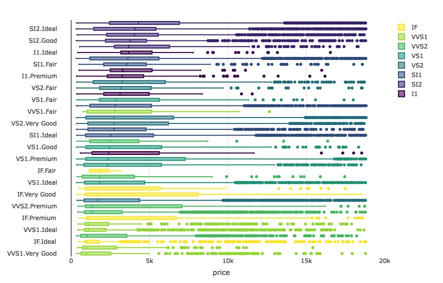
Box Plot
d <- diamonds %>%
  mutate(cc = interaction(clarity, cut))

# interaction levels sorted by median price
lvls <- d %>%
  group_by(cc) %>%
  summarise(m = median(price)) %>%
  arrange(m) %>%
  .[["cc"]]

plot_ly(d, x = ~price, y = ~factor(cc, lvls)) %>%
  add_boxplot(color = ~clarity) %>%
  layout(yaxis = list(title = ""),
         margin = list(l = 100)
         )
Surface Plot
x <- seq_len(nrow(volcano)) + 100
y <- seq_len(ncol(volcano)) + 500

plot_ly() %>%
  add_surface(x = ~x, y = ~y, z = ~volcano)
Conclusion
As you can see plotly is a powerful visualization tool that can create superb graphics in just a few lines of code. I haven’t even touched on the amazing geospatial visualizations that plotly can make, it’s truly world class. I’m not big into data visualization but I’m certain that plotly will come in handy many times in the future. Not to mention just how fun it is to use!
Further Learning Resources
- https://plotly-book.cpsievert.me/index.html
- https://help.plot.ly/tutorials/
- https://www.datacamp.com/community/open-courses/plotly-tutorial-plotly-and-r
- https://cran.r-project.org/web/packages/plotly/plotly.pdf
Until next time,
- Fisher
Comments