Recently I completed Data Camp’s short course on Working With Geospatial Data in R, taught by Charolette Wickham. The course was around four hours long and introduced a variety of packages and methods for geospatial analysis using R. It’s an engaging tutorial, and was well worth my time, even though I’m not hoping to specialize in spatial analysis. Loading, manipulating, and visualizing spatial data can have a steep learning curve, but it’s pretty fun once you get the hang of it.
To help cement these blossoming skills, This post is dedicated to
creating spatial visualizations to help me plan my next hypothetical
adventure abroad! To begin, I need to load some essential spatial
analysis packages. The packages ggmap, sp, tmap, rgdal,
classInt, and viridisLite were all covered in Data Camp’s spatial
analysis course. The course also covered raster, tigris, and
RColorBrewer, but I’m not going to use them in this post, I’d rather
narrow my focus to ggmap and tmap for now.
library('tidyverse')
library('ggmap')
library('sp')
library('tmap')
library('rgdal')
library('classInt')
library('viridisLite')
Now that the packages are loaded, let’s download some data and have a look at the world to get the wanderlust flowing!
# Load World dataset from package tmap
data("World")

# Plot the world according to population
tm_shape(World) +
  tm_borders() +
  tm_fill(title = "Population Estimate",
          col = "pop_est",
          style = "fisher",
          labels = c("0 - 33 Million",
                     "33 - 105 Million",
                     "105 - 220 Million",
                     "220 - 740 Million",
                     "740 - 1,339 Million"
                     )
          ) +
  tm_style_natural() +
  tm_compass() +
  tm_layout(frame = F)
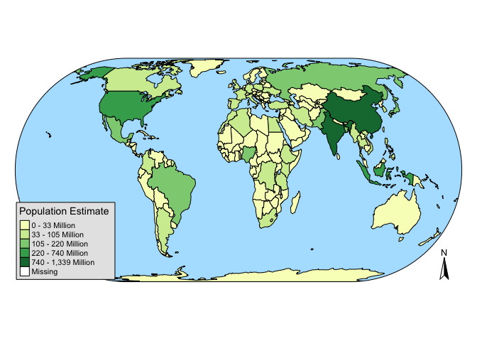
This is a pretty cool map, informative and pleasing to the eye. I think
the fisher method of processing the color breaks for population was a
good choice. Now let’s see the world divided up by economic development!
I just recently got back from a trip to South East Asia, and I’m looking
to go somewhere a little more developed this time!
# Create a custom color palette
vir <- viridis(5)

# Plot the world based on economic development
tm_shape(World) +
  tm_borders() +
  tm_compass() +
  tm_fill(title ="Economic Development",
          col = "economy",
          palette = vir,
          style = "quantile"
          )
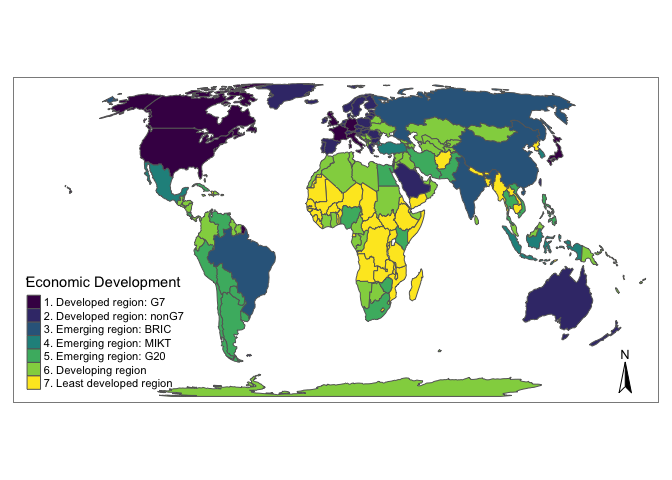
I really like the viridisLite color palettes, they’re specially
designed to work with color-blindness and they translate to grayscale
well. After viewing this plot of economic development, I’m thinking that
a trip to Europe will be in my near future! But what part of Europe?
# Load tmap package data on Europe
data(Europe)

# Plot a map of Europe based on geographic divisions
tm_shape(Europe) +
  tm_borders() +
  tm_fill(title = "Part",
          col = "part",
          palette = vir,
          textNA = "Not Europe"
          ) +
  tm_style_white()
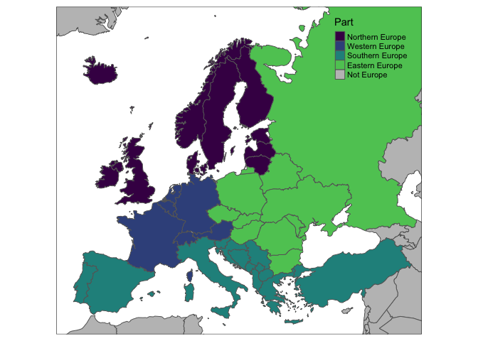
Don’t let Czechia know that the tmap package considers them Eastern
Europe! Of course, these divisions come from the United Nations
Statistical Division, and don’t include a category for Central Europe.
Moving forward, I think a trip to Southern Europe would be just what I’m
looking for! Let’s have a look at just the countries of Southern Europe,
with the colors based on population.
# make a variable to plot only Southern Europe countries
s_europe <- Europe$part == "Southern Europe"

# loop through s_europe and remove N/A
for (i in seq_along(s_europe)) {
  if ( is.na(s_europe[[i]]) ) {
    s_europe[[i]] <- FALSE
  }
}

# Reset the color palette for 4 variables
vir <- viridis(4)

# Map Southern Europe by population
tm_shape(Europe[s_europe,]) +
  tm_borders() +
  tm_fill(title = "Population Estimate (millions)",
          col = "pop_est",
          palette = vir,
          labels = c("0 - 20",
                     "20 - 40",
                     "40 - 60",
                     "60 - 80")
          ) +
  tm_style_white() +
  tm_text("iso_a3", size="AREA", root=5) +
  tm_layout(title = "Southern Europe by Population",
            inner.margins = c(0.05, 0.1, 0.25, 0.05),
            scale = 0.85
            )
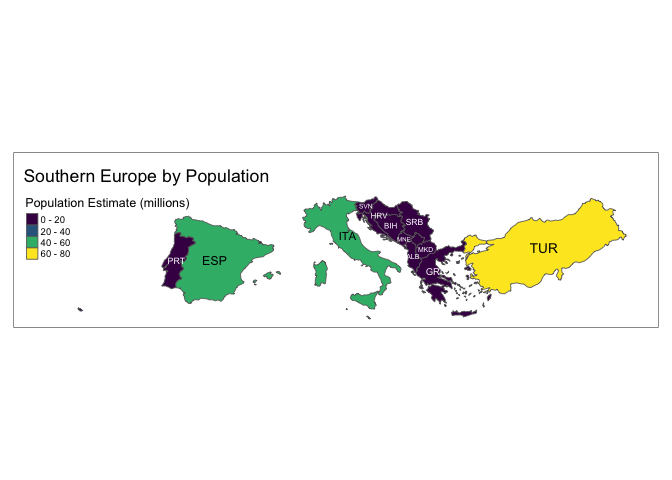
There’s probably an easier way to plot only the countries of Southern
Europe, but I wanted a chance to practice my iteration skills. Of these
countries, I’ve decided that Greece is the place for me! Even though
I’ve already been twice before, I think a third trip is just what I’m
looking for. I’ve downloaded a shapefile from
here to
practice using the rgdal package for loading spatial data.
# Read in a the greece shapefile.
grc_shape <- readOGR("input/periphereies", "periphereies")

## OGR data source with driver: ESRI Shapefile
## Source: "input/periphereies", layer: "periphereies"
## with 13 features
## It has 1 fields

# What kind of data is included in this shapefile?
str(grc_shape, max.level = 2)

## Formal class 'SpatialPolygonsDataFrame' [package "sp"] with 5 slots
##   ..@ data       :'data.frame':  13 obs. of  1 variable:
##   ..@ polygons   :List of 13
##   ..@ plotOrder  : int [1:13] 2 8 10 1 5 9 3 4 12 7 ...
##   ..@ bbox       : num [1:2, 1:2] 104011 3850811 1007936 4623914
##   .. ..- attr(*, "dimnames")=List of 2
##   ..@ proj4string:Formal class 'CRS' [package "sp"] with 1 slot
# Visualize greece with Greek flag colors
tm_shape(grc_shape, simplify = .5) +
  tm_borders(lwd = 1, col = "#ffffff") +
  tm_fill(col = "#0D5EAF") +
  tm_layout(frame = F,
            title = "GREECE",
            fontface = 4)
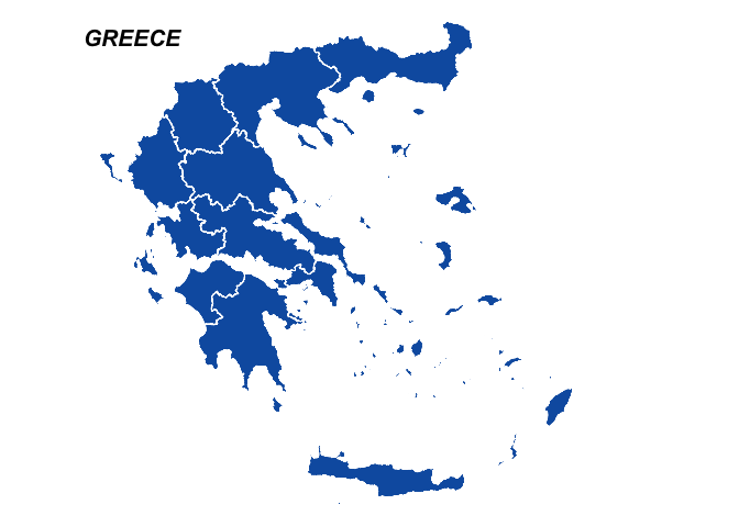
While this visualization isn’t extremely informative, it’s nice to look at! The white and blue color combination mimics the Greek flag. The shapefile I created this map from has data stored within it, but it’s all written using math symbols! Ah well, it’s all Greek to me.
Now I need to get down to buisness and find somewhere to stay! How about an Airbnb? Good thing Airbnb has an awesome feature for easy DIY data visualization! I was able to retrieve information on Airbnb in Athens from http://insideairbnb.com/get-the-data.html.
# load the stored airbnb .csv file
athens_airbnb <- read_csv("input/airbnb_data.csv")

# google and set coordinates for the city of athens
athens_coord <- c(lon = 23.7325, lat = 37.9868)

# from classInt package, divide airbnb prices into 5 categories
classIntervals(athens_airbnb$price, n = 5, style = "quantile")

## style: quantile
##    [9,25)   [25,35)   [35,46)   [46,69) [69,5000]
##       780      1081      1208      1021      1037

breaks <- c(9,25,35,46,69,5000)
labels <- c("$9 - $25", "$25 - $35", "$35 - $46", "$46 - $69", "$69+")
athens_airbnb$price <- cut(athens_airbnb$price, breaks = breaks, labels = labels)

# retrieve map for athens based on coordinates
athens <- get_map(athens_coord, zoom = 13, scale = 1, maptype="terrain")

# remove NA prices
athens_airbnb <- athens_airbnb %>%
  filter(!is.na(price))

# Plot airbnb by price in Athens
ggmap(athens) +
  geom_point(data = athens_airbnb,
             aes(longitude, latitude, col = price),
             alpha = 0.5) +
  theme_set(theme_bw()) +
  theme(legend.key=element_blank(),
        axis.ticks = element_blank(),
        axis.text = element_blank(),
        axis.title = element_blank()) +
  scale_color_manual(name = "Price per Night",
                     values = c("#0D0887FF", "#7E03A8FF", "#CC4678FF", "#F89441FF", "#F0F921FF"))
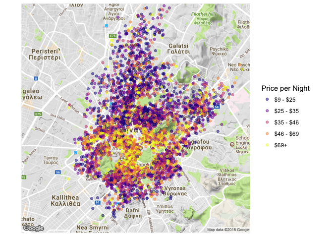
It looks like there are a lot of low-budget options for accommodation in Athens! That’s great, but I’m feeling like a big-spender. Let’s see the swankiest stays that Airbnb has to offer! And I only stay in places that have a few reviews on them already, to make sure they’re legit.
# I only want to stay next to the Acropolis
acropolis_coord <- c(lon = 23.7257, lat = 37.9715)
athens_zoom <- get_map(acropolis_coord, zoom = 15, scale = 1, maptype="terrain")

# load airbnb data
athens_airbnb <- read_csv("input/airbnb_data.csv")

# Filter for the most expensive airbnb's with reviews
swanky_bnb <- athens_airbnb %>%
  filter(price > 150 & number_of_reviews > 5)

# use the classInt package to divide the prices into five categories
classIntervals(swanky_bnb$price, n = 5, style = "quantile")

## style: quantile
##   one of 58,905 possible partitions of this variable into 5 classes
##  [154,171)  [171,200)  [200,250)  [250,313) [313,1000]
##         12          9         11         13         12

breaks <- c(154,171,200,250,313,1000)
labels <- c("$154 - $171", "$171 - $200", "$200 - $250", "$250 - $313", "$313 - $1000")
swanky_bnb$price <- cut(swanky_bnb$price, breaks = breaks, labels = labels)

# filter out the NA prices
swanky_bnb <- swanky_bnb %>%
  filter(!is.na(price))

# map of the swankiest Airbnbs in Athens
ggmap(athens_zoom) +
  geom_point(data = swanky_bnb,
             aes(longitude, latitude, col = price),
             alpha = 0.8,
             size = 6) +
  theme_set(theme_bw()) +
  theme(legend.key=element_blank(),
        axis.ticks = element_blank(),
        axis.text = element_blank(),
        axis.title = element_blank()) +
  scale_color_manual(name = "Price per Night",
                     values = c("#0D0887FF", "#7E03A8FF", "#CC4678FF", "#F89441FF", "#F0F921FF"))
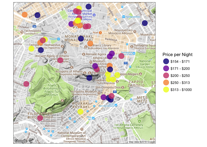
I think that $250 - $315 BnB next to Hadrian’s Library is the one for me! I’m sure this would have been easier to do on Airbnb.com, but then I wouldn’t have been able to practice my R skills would I?
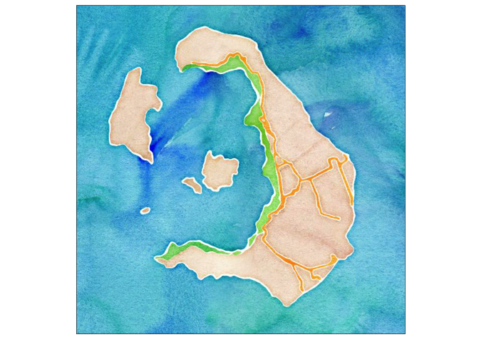
To make up for spending so much on accommodation, I think I’ll have make my own souvenirs ahead of time! How about a nice painting of the most famous Greek island, Santorini?
# Load Santorini Lat / Lon coordinates
santorini_coord <- c(lon = 25.4115, lat = 36.4052)

# Download a watercolor map of Santorini
invisible(santorini <- get_map(santorini_coord, zoom = 12, scale = 1, maptype="watercolor"))

# Plot the map
ggmap(santorini) +
  theme(legend.key=element_blank(),
        axis.ticks = element_blank(),
        axis.text = element_blank(),
        axis.title = element_blank())
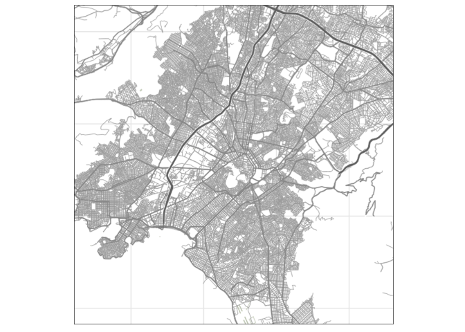
That’s great! And I want a modern-style map of the streets of Athens too!
# declare the coordinates to Athens again
athens_coord <- c(lon = 23.7205, lat = 37.9780)

# Download a terrain-lines map of Athens
invisible(greece <- get_map(athens_coord, zoom = 12, scale = 1, maptype = "terrain-lines"))

# plot the map
ggmap(greece) +
    theme(legend.key=element_blank(),
        axis.ticks = element_blank(),
        axis.text = element_blank(),
        axis.title = element_blank())
Alright! I’m all ready to go on my trip and planning it was half the
fun. The ggmap and tmap packages have so many applications, and I’m
excited to explore beyond this cursory example of their capabilities. So
much to learn so little time!
Until next time,
- Fisher
Comments