Introduction
This is the first of eight installments of my Unpacking the Tidyverse series. Each installment focuses on one of the eight core packages in Hadley Wickham’s tidyverse. Instructions given in each post are mainly derived from Hadley’s textbook, R for Data Science, and CRAN package documentation. This installment of Unpacking the Tidyverse focuses on the graphing package, ggplot2. The next installment focuses on the readr package and can be found here.
The ggplot2 package is a powerful data visualization tool based on the grammar of graphics: an idea that any plot can be described using seven distinct parameters. In this blog post, I run through these parameters attempting summarize them in an easy-to-access resource for some of the most common tasks in data visualization.
library('ggplot2')
library('RColorBrewer')
library('viridisLite')
Template
ggplot( ***dataset*** ) +
geom_***geometry***(
  mapping = aes( ***variables*** ),
  stat = ***statistical transformation***,
  position = ***position adjustment***
) +
coord_***coordinate system****() +
facet_***facet declaration***()
Not all parameters must be defined for every ggplot call, but by defining the dataset, plot geometry, variables, statistical transformations, position adjustments, coordinate system and facets, you can create almost any plot with ggplot2. Of course, there are additional functions that affect the aesthetics of the plot, such as annotations, titles, axes, and legends. Let’s briefly cover all seven of these parameters, discussing the commands that I most commonly find useful for each of them.
Data
ggplot(mpg)

Just calling ggplot() with an associated dataset will create a canvas
for your graphic, not an actual plot. This is because R doesn’t know
what variables you want plotted from that dataset, or how you want them
plotted. To create a basic plot, you’ll have to provide information on
the plot’s geometry.
Geometries
ggplot(mpg) +
  geom_point(mapping = aes(x = displ, y = hwy, color = cyl))

Plot geometries are the most important parameter, and the only parameter
other than ggplot() that must be defined in every single
visualization. There are hundreds of geometries available for your use,
courtesy of the R community; check out http://www.ggplot2-exts.org/
for more information. Here’s a list of the handful of geometries,
mappings, and aesthetics that I use most often.
Geometries
- geom_density( ) - 1 variable Gaussian distribution
- geom_point( ) - 2, 3, or 4 variable scatterplot
- geom_smooth( ) - 2 or 3 variable line plot
- geom_bar(stat=”identity”) - 2 or 3 variable bar plot
- geom_hex( ) - 2 variable distribution
- geom_tile( ) - 3 variable tile plot
- geom_map( ) - 2, 3, or 4 variable geospatial
Mappings
- aes( x = ) - x-axis location
- aes( y = ) - y-axis location
- aes( …, color = ) - color dependent on variable’s value
- aes( …, linetype = ) - line type dependent on variable’s value
- aes( …, size = ) - size of object dependent on variable’s value
Aestetics
- size = size of a point, declared by an integer
- linetype = 0 (blank), 1 (solid), 1 (dashed), 3 (dotted), 4 (dot-dash), 5 (long-dash), 6 (two-dash)
- weight = (line thickness) integer
- color = (outline) string
- fill = (inside) string
- alpha = (transparency) double from 0 to 1
Statistical Transformation
Statistical transformations are most useful with geom_bar. Each
geometry has an associated transformation, and most of the time this
transformation is useful and should not be changed. The default
transformation associated with geom_bar is "count", or the total
number of occurrences of each variable. Sometimes you want a bar chart
to visualize something else, like the unique occurrences of each
variable, or a different variable all together. These three
transformations allow you control over bar charts to visualize your data
in entirely new ways.
- geom_bar(aes(…), stat = “count”) - visualize the number of entries in a variable, n()
- geom_bar(aes(…), stat = “identity”) - visualize the variable, not the count
- geom_bar(aes(…), stat = “unique”) - visualize only unique components of the variable
Position Adjustment
When there are multiple data points occupying the same space or are stacked too closely together, position adjustments allow for a clearer visualization. Most often used with bar charts and scatter plots, these are the three position adjustments I find to be the most useful.
- geom_point(aes(…), position = “jitter”) - adds a small amount of noise to better view overlapping points
- geom_bar(aes(…), position = “dodge”) - arranges bar elements side-by-side
- geom_bar(aes(…), position = “fill”) - arranges bar elements on top of each other, normalizing height
Coordinate Systems
ggplot(mpg) +
  geom_point(mapping = aes(x = displ, y = hwy)) +
  coord_flip()

Cartesian coordinates are the go-to most visualizations, but the coord_ function does more than call different coordinate systems. Often, it’s useful to fix the x-y ratio, or flip the axis of bar charts. When you’re working with exponential data, you may want to transform an axis to a logarithmic system. These useful functions and many more can be done by the coord_ function.
- coord_fixed(ratio, xlim, ylim) - fixing the aspect ratio between x and y
- coord_flip(xlim, wlim) - flipping the axes
- coord_polar(theta, start, direction) - converting Cartesian to polar coordinates
- coord_trans(xtrans, ytrans, limx, limy) - transform Cartesian coordinates, use with log functions
- coord_map(projection, orientation, xlim, ylim) - mapproj package projections
Facets
ggplot(data = mpg) +
  geom_point(mapping = aes(x = displ, y = hwy)) +
  facet_wrap(~ class, nrow = 2)

I don’t use facets that often, but if you’re a fan multiple miniature plots, you might find these faceting options useful.
- facet_grid(x ~ y, labeller, scales) - facets the display into rows and columns based on the two given variables (“.”” placeholder)
- facet_wrap(~ x, labeller, scales, nrow, ncol) - wraps facets into a rectangular layout
Labels
ggplot(mpg) +
  labs(
    title = "title",
    subtitle = "subtitle",
    caption = "caption",
    xlab = "x-label",
    ylab = "y-label"
  )

Labels are helpful for properly communicating your visualization. Including these five labels with your plots can help clarify your topic, variables, and sources.
Annotations
Annotations can be helpful to point out specific properties of a visualization. I think annotating multiple individual observations is a mistake, it clutters the graphic and takes away from the effectiveness of the visualization. Packages like plotly and shiny do a better job of creating interactive graphics if you want individual labels. With that in mind, here are some annotations that are easy to use in ggplot2.
- geom_text(aes(label = “text here”), vjust = , hjust = ) - places a summary annotation within the graphic, according to vjust and hjust
- geom_hline(yintercept = , size = , color = , linetype) - creates a horizontal reference line through the plot according to yintercept
- geom_vline(xintercept = , size =, color =, linetype =) - creates a vertical reference line through the plot according to xintercept
- geom_rect(aes(xmin = , xmax = , ymin = , ymax = )) - creates a rectangle to box in and highlight interesting data
- geom_segment(aes(x = , y = , xend = , yend = ,) arrow = ) - creates a line segment within the plot, it can be an arrow
Scales
Scales are automatically set when you create a ggplot, but sometimes it’s useful to alter the color scheme, legend, or axes. The naming scheme for these functions is scale_ followed by the name of the aesthetic then another _, and then the name of the scale.
Aestetic Names
- _x_
- _y_
- _alpha_
- _color_
- _fill_
- _linetype_
- _shape_
- _size_
Scale Names
- _discrete - maps discrete variables to visual values
- _continous - maps continuous variables to visual values
- _identity - uses data values as visual values
- _manual - values = c( ), maps discrete values to manually chose visual values
- _gradient - creates a two-color gradient, low - high
- _gradient2 - creates a diverging two color gradients, positive - negative
- _gray -creates a gradient in gray
- _brewer - brewer( palette = “ “), calls RColorBrewer palettes
Axes
Scales can also be used to alter axes in ggplot2, these are some commented examples for fixing common behavioral issues you may have with your axes.
scale_x_continuous(breaks = seq(0, 10, by = 1), labels = c(1:9, "ten"))
# define breaks by sequence, define labels of breaks

scale_x_discrete(breaks=c("ctrl", "trt1", "trt2"),            # defined tick marks
                 labels=c("Control", "Treat 1", "Treat 2"))   # new names

expand_limits(x = c(0,8), y = c(0,8))                         # expand the limits of the graph to visualize specific values

scale_y_reverse()     # Reverse y-axis direction (zero on top)

element_blank()       # Hiding axis labels

theme(axis.title.x = element_text(face="bold", color="red", size=20),  # change axis labels, font and style
      axis.text.x = element_text(angle=90, vjust=0.5, size=16))        # change tick mark label, font, style

theme(panel.grid.major=element_blank(),  # hiding major gridlines
      panel.grid.minor=element_blank())  # hiding minor gridlines

library(scales)   # changing the y-axis to log 10
scale_y_log10(breaks = trans_breaks("log10", function(x) 10^x),
              labels = trans_format("log10", math_format(10^.x)))
Legends
Legends can be a bit harder to wrangle than axes. Here are examples to several common problems I have with legends.
theme(legend.position = "left")    # legend to the left of plot
theme(legend.position = "top")     # legend above plot
theme(legend.position = "bottom")  # legend below plot
theme(legend.position = "right")   # the default
theme(legend.position = "none")    # no legend will be generated

geom_point(aes(...), show.legend=FALSE) # don't include this geom in the legend

theme(legend.title = element_blank()) # hides the legends title

# changing the order of items in your legend, scale_ function is dependent upon the type of plot
scale_fill_discrete(breaks=(c("item1", "item2", "item3")))

# simply reverse the current item display in the legend
scale_fill_discrete(guide = guide_legend(reverse=TRUE))

# manually alter color, break, label, and name of legend items.
scale_fill_manual(values=c("#999999", "#E69F00", "#56B4E9"),
                  name="Experimental\nCondition",
                  breaks=c("ctrl", "trt1", "trt2"),
                  labels=c("Control", "Treatment 1", "Treatment 2"))
Colors
Some of my favorite preset colors include
- thistle
- slateblue2
- orchid
- midnightblue
- deepskyblue
- lightslateblue
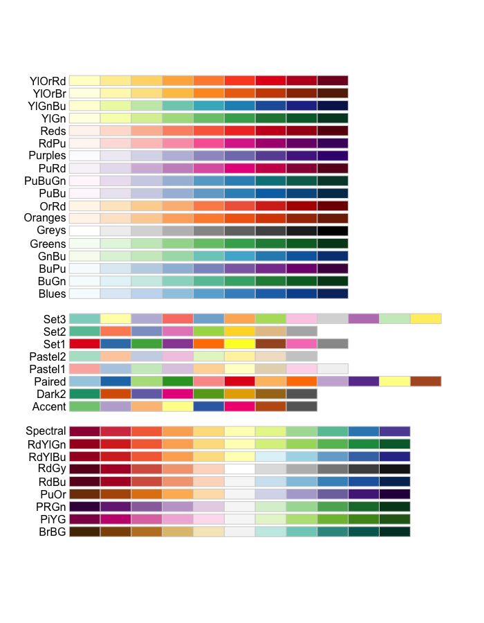
The RColorBrewer package also has some great color palettes.
RColorBrewer::display.brewer.all()
The viridisLite Package has contains 5 color scales that are color-blind and gray-scale friendly.

Themes
Sometimes you don’t want to go through the effort of creating your own theme, so ggplot2 has some built in. Here are four basic themes that are excellent for exploratory analysis or creating a solid foundation to build off.
- theme_bw() - A while background with gridlines
- theme_grey() - the default theme
- theme_classic() - A white background with no gridlines
- theme_minimal() - mystery theme, check it out!
Final Thoughts
This is just a small taste of what ggplot2 can do, but with this information you should be able to solve 80% of your graphing needs. Again, the references listed at the beginning of this write up are excellent and worth checking out. If you want to learn more about R for Data Science written by Hadley Wickham, it’s free to read at http://r4ds.had.co.nz/. If you don’t want to read through the entire book, check out the other posts in my R for Data Science Summary Series.
For more useful resources, including advanced ggplot2 techniques, check out these links:
- R Graphics ggplot2 Cookbook
- Top 50 Visualizations
- R Studio’s ggplot2 Cheat Sheet
- Hadley’s ggplot2 Book for sale
Thanks for reading,
- Fisher
Comments